Research projects are of course not comparable with companies selling products and thus the relevance and importance of a proper logo is for sure much lower.
Nevertheless, especially for dissemination purposes, the online presence and to reach our target groups, logos are also essential for us scientists.
A logo graphically represents the corporate identity of a project and is therefore part of its visual appearance. Just as one example, I was extremely proud of the logo for my previous ERC project AcrossBorders which is easy to recognize (I believe).
A logo should hold ideally a signal effect and provide information about the project at one glance – thus, it is not an easy task to design such a logo which also meets aesthetic values underlining the independence of the specific project.
Today, I am very proud to introduce the new DiverseNile logo – as with the MUAFS logo, the original ideas came from my side, but the realisation, complex design and final version are indebted to the creativity of hertha produziert, the Viennese graphic specialists who also produced already the great AcrossBorders image video.
So let’s see together what the new logo wants to sell:
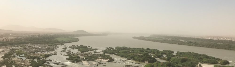
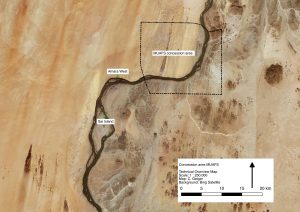
The outline of the logo is the exact outline of our concession area. The DiverseNile project will investigate this specific region of the Middle Nile in Sudan as a case study.
The two outstretched arms represent both the very specific course of the Nile in our concession as well as the cultural contacts between Egyptians (coming from the north) and Nubians (coming from the south). We are by now much aware that this cultural contact during the Bronze Age in Nubia did not happen in a one direction only, with the Egyptians as the prominent actors but that technological transfer, exchange and contact occurred in both directions and was very dynamic, including diverse groups of people. To reconstruct the actual cultural diversity in our research concession is one of the prime goals, highlighted by the colourful letters of “Diverse” in the logo. The arms almost touching each other in the logo also illustrate our understanding of contact spaces. Within the DiverseNile project, we comprehend contact spaces as “social spaces where human actors meet, perceive and constitute otherness, clash, and grapple with each other” (Stockhammer and Athanassov 2018: 106).
The slightly different colour shades of the DiverseNile logo symbolise the landscape approach of the project – the Nile as a changing environment and the concession area as a geological border zone are important factors. The colour shades also illustrate the major differences between the East and West banks of the Nile in our concession – with desert environment and open hinterland towards oases and transport routes on the West bank and rocky hills and mountains on the East bank with ancient mining and quarrying activities.
I really hope our efforts in pointing out the most relevant aspects of DiverseNile in this graphic design were successful and will help introducing the new project to our target groups. Feedback is of course much appreciated!
Reference
Stockhammer/Athanassov 2018 = Stockhammer, P.W. and Athanassov, B. 2018. Conceptualising Contact Zones and Contact Spaces: An Archaeological Perspective, 93‒112, in: S. Gimatzidis, M. Pieniążek and S. Mangaloğlu-Votruba (eds.), Archaeology across Frontiers and Borderlands. Fragmentation and Connectivity in the North Aegean and the Central Balkans from the Bronze Age to the Iron Age. OREA 9. Vienna.